Text Field (Текстовое поле)
Текстовые поля позволяют пользователям вводить и редактировать текст.
Текстовые поля позволяют пользователям вводить текст в интерфейсе. Обычно они появляются в формах и диалогах.
Basic TextField
The TextField wrapper component is a complete form control including a label, input, and help text. It comes with three variants: outlined (default), filled, and standard.
<TextField id="outlined-basic" label="Outlined" variant="outlined" />
<TextField id="filled-basic" label="Filled" variant="filled" />
<TextField id="standard-basic" label="Standard" variant="standard" />
Note: The standard variant of the TextField is no longer documented in the Material Design guidelines (here's why), but Material-UI will continue to support it.
Form props
Standard form attributes are supported e.g. required, disabled, type, etc. as well as a helperText which is used to give context about a field's input, such as how the input will be used.
Validation
The error prop toggles the error state. The helperText prop can then be used to provide feedback to the user about the error.
Multiline
The multiline prop transforms the text field into a textarea or a TextareaAutosize. Unless the rows prop is set, the height of the text field dynamically matches its content (using TextareaAutosize). You can use the minRows and maxRows props to bound it.
Select (Список)
The select prop makes the text field use the Select component internally.
Украшения поля ввода (Input)
The main way is with an InputAdornment. This can be used to add a prefix, a suffix, or an action to an input. This can be used to add a prefix, a suffix or an action to an input.
Kg
Kg
Weight
$
Kg
Kg
Weight
$
Kg
Kg
Weight
$
The filled variant input height can be further reduced by rendering the label outside of it.
<TextField
  hiddenLabel
  id="filled-hidden-label-small"
  defaultValue="Small"
  variant="filled"
  size="small"
/>
<TextField
  hiddenLabel
  id="filled-hidden-label-normal"
  defaultValue="Normal"
  variant="filled"
/>
Margin
The margin prop can be used to alter the vertical spacing of the text field. Using none (default) doesn't apply margins to the FormControl whereas dense and normal do.
<RedBar />
<TextField label={'margin="none"'} id="margin-none" />
<RedBar />
<TextField label={'margin="dense"'} id="margin-dense" margin="dense" />
<RedBar />
<TextField label={'margin="normal"'} id="margin-normal" margin="normal" />
<RedBar /><TextField fullWidth label={'fullWidth'} id="fullWidth" /><TextField
id="outlined-name"
label="Name"
value={name}
onChange={handleChange}
/>
<TextField
id="outlined-uncontrolled"
label="Uncontrolled"
defaultValue="foo"
/>Компоненты
TextField состоит из более мелких компонентов ( FormControl, Input, FilledInput, InputLabel, OutlinedInput, и FormHelperText ) которые вы можете использовать напрямую, чтобы значительно кастомизировать ваши поля ввода.
Вы также могли заметить, что некоторые нативные свойства ввода HTML отсутствуют в компоненте TextField. Это сделано специально. The component takes care of the most used properties. Then, it's up to the user to use the underlying component shown in the following demo. Вы все еще можете использовать inputProps (и свойства InputProps, InputLabelProps), если хотите избежать излишнего кода.
<Input defaultValue="Hello world" inputProps={ariaLabel} />
<Input placeholder="Placeholder" inputProps={ariaLabel} />
<Input disabled defaultValue="Disabled" inputProps={ariaLabel} />
<Input defaultValue="Error" error inputProps={ariaLabel} /><TextField label="Outlined secondary" color="secondary" focused />
<TextField label="Filled success" variant="filled" color="success" focused />
<TextField
label="Standard warning"
variant="standard"
color="warning"
focused
/>Кастомизированные поля ввода
Ниже находятся примеры кастомизации компонента. Вы можете узнать об этом больше в документации по переопределению свойств.
Customization does not stop at CSS. You can use composition to build custom components and give your app a unique feel. Ниже приведен пример использования компонента InputBase, вдохновленный Google Maps.
🎨 If you are looking for inspiration, you can check MUI Treasury's customization examples.
useFormControl
For advanced customization use cases, a useFormControl() hook is exposed. This hook returns the context value of the parent FormControl component.
API
import { useFormControl } from '@material-ui/core/FormControl';
Возвращает
value (object):
value.adornedStart(bool): Indicate whether the childInputorSelectcomponent has a start adornment.value.setAdornedStart(func): Setter function foradornedStartstate value.value.color(string): The theme color is being used, inherited fromFormControlcolorprop .value.disabled(bool): Indicate whether the component is being displayed in a disabled state, inherited fromFormControldisabledprop.value.error(bool): Indicate whether the component is being displayed in an error state, inherited fromFormControlerrorpropvalue.filled(bool): Indicate whether input is filledvalue.focused(bool): Indicate whether the component and its children are being displayed in a focused statevalue.fullWidth(bool): Indicate whether the component is taking up the full width of its container, inherited fromFormControlfullWidthpropvalue.hiddenLabel(bool): Indicate whether the label is being hidden, inherited fromFormControlhiddenLabelpropvalue.required(bool): Indicate whether the label is indicating that the input is required input, inherited from theFormControlrequiredpropvalue.size(string): The size of the component, inherited from theFormControlsizepropvalue.variant(string): The variant is being used by theFormControlcomponent and its children, inherited fromFormControlvariantpropvalue.onBlur(func): Should be called when the input is blurredvalue.onFocus(func): Should be called when the input is focusedvalue.onEmpty(func): Should be called when the input is emptiedvalue.onFilled(func): Should be called when the input is filled
Пример
<FormControl sx={{ width: '25ch' }}>
  <OutlinedInput placeholder="Please enter text" />
  <MyFormHelperText />
</FormControl>
Ограничения
Сжатие
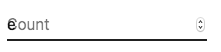
Состояние метки поля ввода (label) "shrink" не всегда корректно. Предполагается, что метка поля ввода уменьшается, как только в поле ввода что-нибудь отображается. В некоторых случаях мы не можем определить состояние "shrink" (числовое поле, поле даты, Stripe input). Вы могли заметить совпадения.
Чтобы решить эту проблему, вы можете принудительно изменить состояние метки.
<TextField InputLabelProps={{ shrink: true }} />
или
<InputLabel shrink>Contagem</InputLabel>
Плавающая метка
The floating label is absolutely positioned. It won't impact the layout of the page. Make sure that the input is larger than the label to display correctly.
type="number"
Inputs of type="number" have potential usability issues:
- Allowing certain non-numeric characters ('e', '+', '-', '.') and silently discarding others and silently discarding others and silently discarding others and silently discarding others
- Если вы составляете компонент:
and more - see this article by the GOV.UK Design System team for a more detailed explanation.
For number validation, one viable alternative is to use the default input type="text" with the pattern attribute, for example:
<TextField inputProps={{ inputMode: 'numeric', pattern: '[0-9]*' }} />
In the future, we might provide a number input component.
Helper text
The helper text prop affects the height of the text field. If two text fields are placed side by side, one with a helper text and one without, they will have different heights. For example:
Please enter your name
<TextField
  helperText="Please enter your name"
  id="demo-helper-text-misaligned"
  label="Name"
/>
<TextField id="demo-helper-text-misaligned-no-helper" label="Name" />
This can be fixed by passing a space character to the helperText prop:
Please enter your name
<TextField
  helperText="Please enter your name"
  id="demo-helper-text-aligned"
  label="Name"
/>
<TextField
  helperText=" "
  id="demo-helper-text-aligned-no-helper"
  label="Name"
/>
Интеграция с сторонними библиотеками текстовых полей
Вы можете использовать сторонние библиотеки для форматирования ввода. Вы должны предоставить пользовательскую реализацию элемента <input> со свойством inputComponent.
В следующем примере используются библиотеки response-text-mask и response-number-format. The same concept could be applied to e.g. react-stripe-element.
The provided input component should expose a ref with a value that implements the following interface:
interface InputElement {
  focus(): void;
  value?: string;
}
const MyInputComponent = React.forwardRef((props, ref) => {
  const { component: Component, ...other } = props;

  // implement `InputElement` interface
  React.useImperativeHandle(ref, () => ({
    focus: () => {
      // logic to focus the rendered component from 3rd party belongs here
    },
    // hiding the value e.g. react-stripe-elements
  }));

  // `Component` will be your `SomeThirdPartyComponent` from below
  return <Component {...other} />;
});

// usage
<TextField
  InputProps={{
    inputComponent: MyInputComponent,
    inputProps: {
      component: SomeThirdPartyComponent,
    },
  }}
/>;
Доступность
In order for the text field to be accessible, the input should be linked to the label and the helper text. The underlying DOM nodes should have this structure:
<FormControl>
  <InputLabel htmlFor="my-input">Адрес электронной почты</InputLabel>
  <Input id="my-input" aria-describedby="my-helper-text" />
  <FormHelperText id="my-helper-text">Мы никогда не распостраним ваш адрес.</FormHelperText>
</FormControl>
- Если вы используете компонент
TextField, вам просто нужно предоставить уникальныйid. - Если вы составляете компонент:
<FormControl>
  <InputLabel htmlFor="my-input">Адрес электронной почты</InputLabel>
  <Input id="my-input" aria-describedby="my-helper-text" />
  <FormHelperText id="my-helper-text">Мы никогда не распостраним ваш адрес.</FormHelperText>
</FormControl>
Дополнительные проекты
For more advanced use cases, you might be able to take advantage of:
- mui-rff Bindings for using Material-UI with React Final Form.
- formik-material-ui: Bindings for using Material-UI with formik.
- redux-form-material-ui: Bindings for using Material-UI with Redux Form.
- mui-rff: Bindings for using Material-UI with React Final Form.